Paquetes
library(tidyverse)
library(lubridate)
library(gganimate)
library(png)
library(gifski)
library(readxl)
Dataset
df <- read_csv(url('https://covid.ourworldindata.org/data/ecdc/full_data.csv'))
## Parsed with column specification:
## cols(
##   date = col_date(format = ""),
##   location = col_character(),
##   new_cases = col_double(),
##   new_deaths = col_double(),
##   total_cases = col_double(),
##   total_deaths = col_double(),
##   weekly_cases = col_double(),
##   weekly_deaths = col_double(),
##   biweekly_cases = col_double(),
##   biweekly_deaths = col_double()
## )
Total de casos confirmados y fallecimientos
Número total (acumulado) de casos confirmados y fallecimientos en el mundo.
df_plot <- df %>%
  filter(location == "World") %>%
  select(date, location, total_cases, total_deaths) %>%
  gather(key = "variable", value = "cantidad", 3:4)


df_plot_animated <- df_plot %>%
  ggplot(aes(x = variable,
             y = cantidad,
             fill = variable)) +
  geom_bar(stat= "identity",
           color = "white",
           show.legend = FALSE) +
  geom_text(aes(label = as.numeric(cantidad)),
            position = position_dodge(0.9),
            vjust= -1.2,
            size = 5,
            color = "darkgrey")+
  scale_y_continuous(labels = scales::comma) +
  scale_fill_manual(values = c("orange", "darkgrey")) +
  theme_minimal()+
  enter_appear() +
  transition_states(date,
                    transition_length = 1,
                    state_length = 1) +
  labs(title = "COVID-19: Contagiados y fallecimientos (acumulado) \n Fecha: {closest_state}",
       subtitle = "",
       y = "",
       x = "",
       caption = "Fuente: https://covid.ourworldindata.org") +
  theme(panel.grid.major.x = element_blank(),
        plot.title = element_text(size = 18,
                                  face = "bold",
                                  hjust = 0.5),
        plot.subtitle = element_text(size=14,
                                     face = "plain",
                                     hjust = 0.5))


animate(df_plot_animated, nframes= 380, width = 600, height= 600, fps = 7)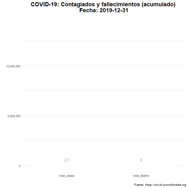
anim_save("df_plot_animated.gif")
Total de nuevos casos y nuevos fallecidos
Número diario de casos confirmados y fallecimientos en el mundo.
df_plot_new <- df %>%
  filter(location == "World") %>%
  select(date, location, new_cases, new_deaths) %>%
  gather(key = "variable", value = "cantidad", 3:4)


df_plot_new_animated <- df_plot_new %>%
  ggplot(aes(x = variable,
             y = cantidad,
             fill = variable)) +
  geom_bar(stat= "identity",
           color = "white",
           show.legend = FALSE) +
  geom_text(aes(label = as.numeric(cantidad)),
            position = position_dodge(0.9),
            vjust= -1.2,
            size = 5,
            color = "darkgrey")+
  scale_y_continuous(labels = scales::comma) +
  scale_fill_manual(values = c("orange", "darkgrey")) +
  theme_minimal()+
  enter_appear() +
  transition_states(date,
                    transition_length = 1,
                    state_length = 1) +
  labs(title = "COVID-19: Contagiados y fallecimientos (diario) \n Fecha {closest_state}",
       subtitle = "",
       y = "",
       x = "",
       caption = "Fuente: https://covid.ourworldindata.org") +
  theme(panel.grid.major.x = element_blank(),
        plot.title = element_text(size = 18,
                                  face = "bold",
                                  hjust = 0.5),
        plot.subtitle = element_text(size=14,
                                     face = "plain",
                                     hjust = 0.5))


animate(df_plot_new_animated, nframes= 390, width = 600, height= 600, fps = 7)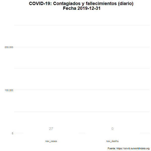
anim_save("df_plot_new_animated.gif")
Evolución del número de nuevos casos confirmados
Evolución temporal del número de personas contagiadas por COVID-19 en el mundo.
df_plot_new_trans <- df %>%
  filter(location == "World") %>%
  select(date, location, new_cases) %>%
  group_by(date)


df_plot_new_transition <- df_plot_new_trans %>%
  group_by(date) %>%
  ggplot(aes(x = date,
             y = new_cases,
             fill = "orange")) +
  geom_bar(stat= "identity",
           color = "white",
           show.legend = FALSE) +
  scale_y_continuous(labels = scales::comma) +
  theme_minimal()+
  enter_appear() +
  transition_states(date) +
  shadow_mark() +
  enter_grow() +
  enter_fade() +
  labs(title = "COVID-19: Contagiados (diario) \n Fecha: {closest_state}",
       subtitle = "",
       y = "",
       x = "",
       caption = "Fuente: https://covid.ourworldindata.org") +
  theme(panel.grid.major.x = element_blank(),
        plot.title = element_text(size = 18,
                                  face = "bold",
                                  hjust = 0.5),
        plot.subtitle = element_text(size=14,
                                     face = "plain",
                                     hjust = 0.5))


animate(df_plot_new_transition, nframes= 390, width = 1000, height= 600, fps = 7)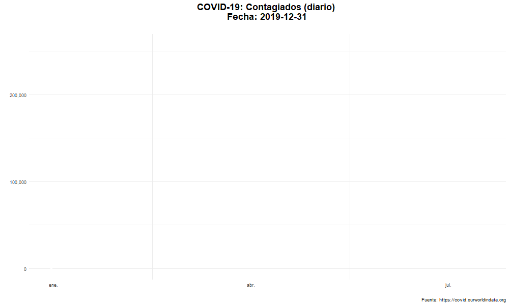
anim_save("df_plot_new_transition.gif")